
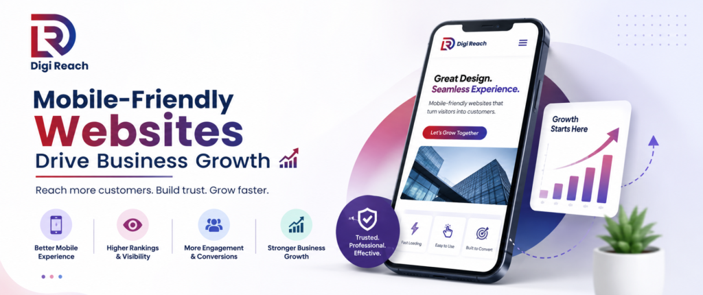
Why Mobile-Friendly Websites Matter for Business Growth in 2026
Today, people use smartphones for almost everything, including searching for products, booking services, reading reviews, and making purchases. Because of this shift, having a mobile-friendly website is no longer optional. Instead, it has become one of the most important factors for online success.
If your website is difficult to use on a mobile device, visitors may leave within seconds. As a result, you lose potential customers, lower your Google rankings, and reduce your chances of generating leads. At DigiReach, we help businesses build fast, responsive, and SEO-friendly websites that perform well on every screen size.
This guide explains why mobile-friendly websites matter, how they affect SEO, and what your business can do to stay ahead in 2026.
What Is a Mobile-Friendly Website?
A mobile-friendly website automatically adjusts its layout, images, text, and navigation to fit smartphones and tablets. Users can easily read content, click buttons, and browse pages without zooming or scrolling sideways.
A responsive website provides the same excellent experience across desktops, tablets, and mobile devices. Therefore, visitors stay longer and are more likely to become customers.
Why Mobile-Friendly Websites Matter for SEO
Google uses mobile-first indexing, meaning it primarily evaluates the mobile version of your website when determining search rankings.
If your mobile website performs poorly, your rankings can drop even if the desktop version looks great.
A mobile-friendly website helps by:
- Improving search engine rankings
- Increasing page speed
- Reducing bounce rate
- Enhancing user experience
- Supporting Google’s mobile-first indexing
- Increasing organic traffic
Because Google values user experience, responsive websites usually perform better in search results.
Better User Experience Means More Customers
Visitors expect websites to load quickly and work perfectly on every device. If your website has tiny text, slow pages, or difficult navigation, users will leave immediately.
A mobile-friendly website offers:
- Easy navigation
- Readable content
- Fast loading pages
- Clickable buttons
- Simple contact forms
- Better accessibility
Consequently, users spend more time exploring your services and are more likely to contact your business.
Mobile Traffic Continues to Grow
More than half of all internet traffic now comes from mobile devices. People search for local businesses while travelling, shopping, or relaxing at home.
Therefore, businesses that ignore mobile users risk losing a large percentage of potential customers.
Whether you own a local shop, healthcare clinic, law firm, restaurant, or eCommerce store, your website should provide a seamless mobile experience.
Faster Websites Improve SEO Performance
Website speed is one of Google’s ranking factors. Mobile users expect pages to load within a few seconds.
A slow website can lead to:
- Higher bounce rates
- Lower search rankings
- Poor customer experience
- Fewer enquiries
- Reduced sales
Optimizing images, reducing unnecessary code, enabling browser caching, and using modern website technologies can significantly improve mobile performance.
Mobile-Friendly Websites Increase Conversions
Visitors who enjoy using your website are more likely to take action.
These actions include:
- Calling your business
- Filling out enquiry forms
- Booking appointments
- Requesting quotations
- Purchasing products
- Signing up for newsletters
A responsive website removes barriers that prevent users from completing these actions.
Local SEO Benefits
Many local searches happen on smartphones.
People search for:
- Digital marketing agency near me
- SEO services nearby
- Best website designer
- Local businesses
If your website works well on mobile devices, users can quickly contact you, view your location, or request your services.
This improves both customer satisfaction and local SEO performance.
Lower Bounce Rate
Bounce rate measures how quickly visitors leave your website.
If mobile users struggle to navigate your pages, they will leave without exploring your services.
A responsive design encourages visitors to:
- Read more content
- Visit multiple pages
- Stay longer
- Interact with your business
Consequently, search engines see positive engagement signals, which may improve rankings over time.
Features Every Mobile-Friendly Website Should Have
A modern website should include:
- Responsive design
- Fast loading speed
- Easy navigation
- Large readable fonts
- Mobile-friendly menus
- Click-to-call buttons
- Optimized images
- Secure HTTPS connection
- Simple contact forms
- Clear call-to-action buttons
These features create a better experience while supporting SEO success.
Common Mobile Website Mistakes
Many businesses unknowingly lose customers because of poor mobile optimization.
Common mistakes include:
- Slow loading pages
- Small text
- Buttons placed too close together
- Pop-ups blocking content
- Unresponsive layouts
- Poor image optimization
- Difficult navigation
- Broken mobile forms
Fixing these issues can improve both rankings and conversions.
How DigiReach Can Help
At DigiReach, we create mobile-friendly websites designed for performance, user experience, and search engine visibility.
Our website services include:
- Responsive website design
- SEO optimization
- Website speed optimization
- Technical SEO improvements
- Mobile usability enhancements
- Conversion rate optimization
- Landing page optimization
- Website maintenance
We build websites that not only look professional but also help businesses generate more traffic, leads, and sales.
Best Practices for Mobile SEO in 2026
To stay competitive, businesses should:
- Use responsive website design.
- Improve Core Web Vitals.
- Compress images without losing quality.
- Reduce unnecessary scripts.
- Write readable content with short paragraphs.
- Optimize title tags and meta descriptions.
- Add structured data where appropriate.
- Use internal links effectively.
- Test your website regularly on different devices.
- Keep navigation simple and user-friendly.
Following these practices improves both user satisfaction and search engine performance.
Conclusion
A mobile-friendly website is one of the most valuable investments for any business. Since most users browse the internet on smartphones, your website must provide a fast, responsive, and enjoyable experience. Moreover, Google rewards mobile-optimized websites with better visibility, improved rankings, and increased organic traffic.
If your website is not mobile-friendly, you could be losing valuable visitors and potential customers every day. At DigiReach, we help businesses build responsive, SEO-optimized websites that deliver excellent performance across all devices. Investing in a mobile-friendly website today will help your business attract more visitors, improve search rankings, and achieve long-term online growth. Follow up Instagram and Facebook for more information.


